Figma Components to Ease Your UIUX Design Journey
Figma is a cloud-based design tool that is similar to Sketch in functionality and features, but with big differences that make Figma better for team collaboration. For those skeptical of such claims, I’ll explain how Figma simplifies the design process and is more effective than other programs at helping designers and teams work together efficiently.
Using components in Figma will help you to save time and resources on your next design project. Creating the simplest UI element can take up many hours. This article will explain what components areand how to make UI elements reusable across projects.
What are components?
Components are reusable UI elements that you can use across your design. A component can be any UI element from a label, an icon to a more complex data table.
You can now avoid working on boring and repetitive parts of designing. When you use components, updates will be automatically applied to every instance of that component, saving valuable design time. This also helps in maintaining consistency across instances of the same element.
Designing with components
Since elements are most often part of a bigger design, components help to maintain consistency as well as speed up the design process by applying changes done to an element to all its instances immediately. Let’s look at an example.
An address book application might have a table that lists one contact per row. Designing a good list view requires finding the right type size, spacing, icons and other graphics. The same component can be used in many places at once, each at a different size with local modifications and differences:
How it works
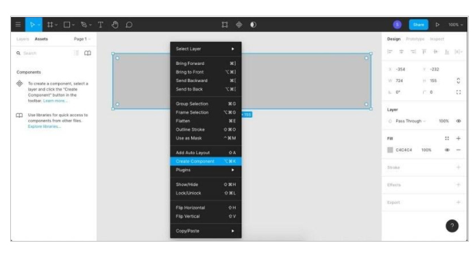
You start by creating the master component. The first time you create a component, it becomes a master component. To create a master component, you need at least two layers. First, select a UI element to make into a component and click the Create Component action in the toolbar. Then define the properties.
Changes made to the master component will automatically affect its instances. However, editing an instance will not affect the master component or its other instances. Editing an instance is overriding the master component’s style and properties.
In the layers panel, you can identify which elements are master components and which are instances by the icon. Master components use a 4-diamond icon and instances use a single diamond icon.
The example below shows the color update of a button’s background and how it updates its instances.
Let’s see what happens if we override the color and stroke in our instances, and then change the original component:
What happens here is that we said, “For this particular instance, let the fill color be dark gray, and for this one let the color and width of the stroke be red and 6px, no matter what the values are for the original component.” When we later make changes to the component, our overrides remain, but other properties which we didn’t override are reflected verbatim.
Any property of any part of an instance can be overridden, including any sub-layers and their properties. If you want to reset the instances and clear the overrides, simply select what you want to clear and click Reset Instance.
Components will greatly improve your design and, more importantly, make your life much easier.
References

Mahen Jayasena
Senior Lead UIDeveloping a Custom Audit Trail and a Notification Service for a Workflow Based Serverless Application on AWS
READ ARTICLE
Human Emotions Recognition through Facial Expressions and Sentiment Analysis for Emotionally Aware Deep Learning Models
READ ARTICLE